Bakemaster wrote:
Pick one please, not two.
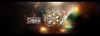
That having been said, you're very good at what you do. The red spiderman sig is fantastic, one of my favorites on this forum. Now do something new. I see a basic formula: one character + background texture + one word. And then one without a character. They are very good, but very simple conceptually. I would like to see what you can do with a broader scene, something more than a character doing a pose.
To go into a little more detail... (try and stop me!)
The theme of the first sig is an effect. Light, altered by medium (in this case, what appears to be stained glass and water). The theme of the rest is a character. What if the theme were an action? For instance, in the red spidey sig I like so much, he's got his webs out there, but due to proportions and framing, the focus is on Spiderman. You could try, just for fun, making a signature with spiderman where the focus is the action of swinging on the web, and another where the focus is the city (Midtown? NYC? don't remember his location). They'd all be spiderman signatures, but they'd be constructed much differently. Spiderman would probably be the smallest, relative to the entire sig, in the one focusing on the city. He might be most centered in the one focusing on the action of swinging (if you're showing movement through the frame, from left to right or right to left).
So in conclusion: I like to hear myself talk. Hope it was useful.
First off sorry about having two, im used to another place that they allow it. and Im glad you like the Spiderman Signature so much hehe. I didnt really think about all you said before. I will most definatly keep that in mind in future ones, might help. Thx alot for all the comments


