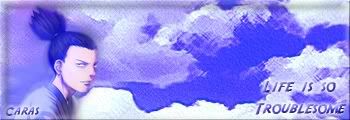
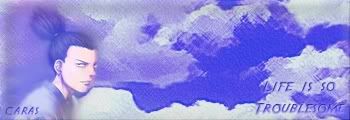
In the very first example of the blue sig, I think the problem there is how the character looks rather blurred in comparison to the background. Against a background with a texture, any flat character is going to look like melting soap over it.
To achieve a better effect, I would remove the canvas texture from the clouds, and perhaps give the character a dark-coloured outer stroke or blur (if he's got smooth enough edges), as well as a border around the whole sig of the same colour. The text is nicely placed, but leaves quite a large empty area in the center of the image, so perhaps you could have "life is so troublesome" all on one line stretching along the bottom edge? Or even the middle. The bevel effect on the text makes it look too soapy, as with the character. And the font is very obviously "Indiana Jones", perhaps a more oriental or handwritten style would look better.

In any case, keep at it. You've only been going a couple of days and you're already pumping out work better than a
lot of people! Feel proud of yourself. x]